From Destinations Set was a bitch to write. I set out to tackle the problem of presenting two separate yet interweaving simultaneous plots. It was something I had touched on before, in ‘Heading South’ and A Call for Submission. You could say that I was obsessed with simultaneity and pushing the limits of the dual narrative technique for a good year or more. I came up with the idea for From Destinations Set in the summer of 2007 as a submission to Bookworks’ Semina series, and knocked out around twenty pages and roughly planned the rest.
It made the 2008 shortlist in the Spring of that year. Realising that to produce anything like a complete working manuscript would take a lot of time and effort, I pushed on with putting some meat on the bones of the remainder. In the end it wasn’t commissioned (I can’t really grumble: the books that did come out are brilliant), but I was committed to seeing the project to completion. It was seriously hard work. Not so much the contents – although some of that was also extremely challenging – but the formatting. Having previously only produced short bursts of simultaneous narrative, inserted within the main body of the text within text boxes, for some reason I thought it would be a good idea to use the columns setting in Word (and I’m still running 97).
Given that the two stories were to run continuously in left and right columns, it meant I had to write both stories at the same time, and any additions / deletions in one narrative meant I had to match them, almost character for character, in the other.
I was explaining the arduous nature of the process to a friend over a few pints the other week, who asked why I’d not just written the stories separately and then pasted them into two columns in Excel. Now why didn’t I think of that?
So, having completed the manuscript, I touted it round a few publishers who looked like they might take such a brain-bendingly unconventional book, but without success. And so the manuscript languished: I had no desire – nor the technical know-how – to reformat it, and assumed that was that, until Stuart at Clinicality, who I’d mailed a copy of the story to, said he’d cracked it and wanted to publish.
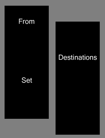
The cover design looks unlike anything my earlier work has been wrapped in, but I do rather like it. While I’m less than keen on minimalist art, as a cover design it’s undeniably striking, and also appropriate, not only to the contradictions of the narratives inside (penned in places in a rather minimalist style, while in others more expansively, and not necessarily confining either style to only one of the two stories), but also the challenges the visual aspects of the text present to the reader. The bold rectangles are very literal representations of the twin columns of the text, and serve as a reminder that Destinations is a very visual text. The placement of the words invites alternative readings: from set destinations, for example. How should the reader approach the physical task of reading the text? One story at a time, a page at a time, cross-column to create a real-time cut-up in the mind? Any and all of these are quite viable options. There are more than simply two stories, and more than two readings here.
To further the sense of variability, the pages in the printed version are unnumbered. As such, the text is complex enough, without the need for a busy or complex cover. Moreover, ‘modernism’ and ‘futurism’ are now historical, and the cover lends it something of a ‘vintage’ feel (I’m personally reminded of Breakthrough by Konstantin Raudive, published in 1971, a remarkable book in every way: http://www.colinsmythe.co.uk/books/brere.htm). Given that Destinations is in many ways concerned with he ‘future’ of narrative and issues of (dis)location in time / space, a cover that drew inspiration from retro representation of futures now past, seemed particularly appropriate. The book is both retro and of the future, and therefore not of any one time, or of any time other than that of its own making.
And in case you’re wondering, the title is a line from the song ‘Double Dare’ by Bauhaus, which is fitting not only because of the ‘double’ narrative, but because a key element of the stories is the sense of the characters’ actions being ‘steered.’ Ostensibly, someone else is writing – and rewriting – their scripts. As such, the writing process is a part of the story: but who is writing the writer? ‘Don’t back away just yet / From destinations set.’ As if they had any choice in the matter.
From Destinations Set is out on Clinicality Press on Monday 2nd August. Here are the opening pages by way of a taster:
http://christophernosnibor.co.uk/Documents/From%20Destinations%20Set%20-%20Section%201.pdf

[…] To find out more about From Destinations Set, here’s a blog I wrote just ahead of its release in September: https://christophernosnibor.wordpress.com/2010/08/02/less-is-more-judging-a-book-by-its-cover/ […]